Not to say that NewsBlur was ugly before today, but it certainly didn’t have the loving embrace of a talented designer. So without waiting another moment (or month) I proudly present the NewsBlur redesign.

It’s a full scale redesign, too. And not just one of those redesigns where the icons get glossier and fonts, bolder. Every moving piece of machinery got more than a coat coast of paint. A number of new crucial reading features have been added. Some features were merged, some were repaired, and some were scrapped.
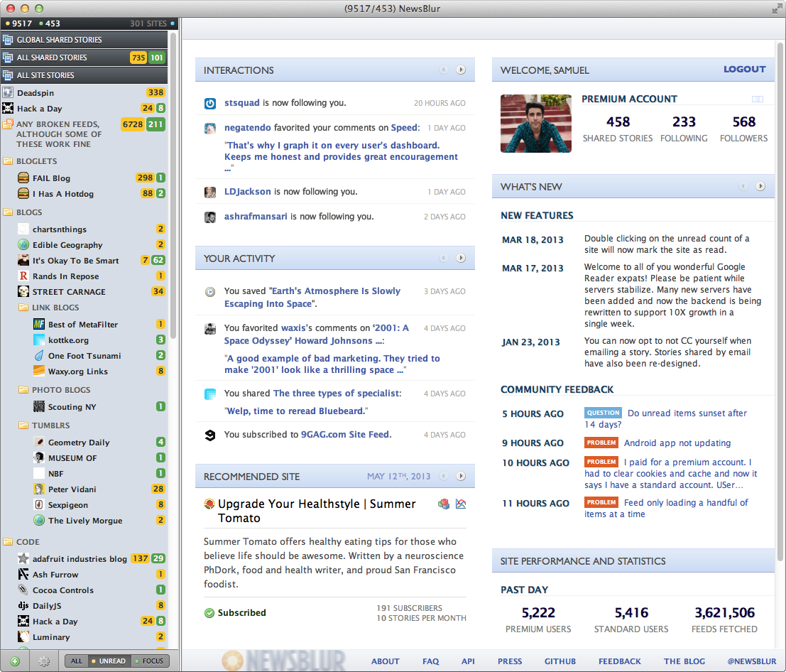
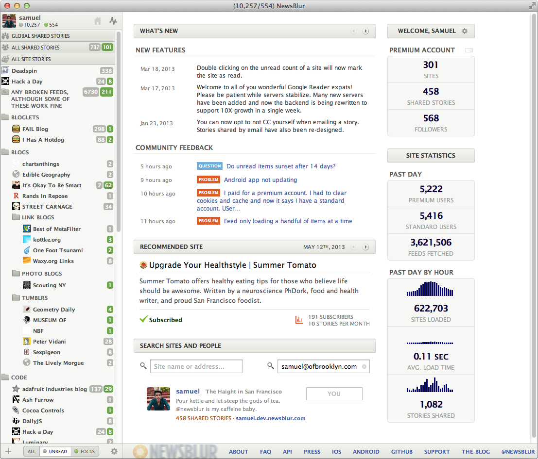
Dashboard before & after:
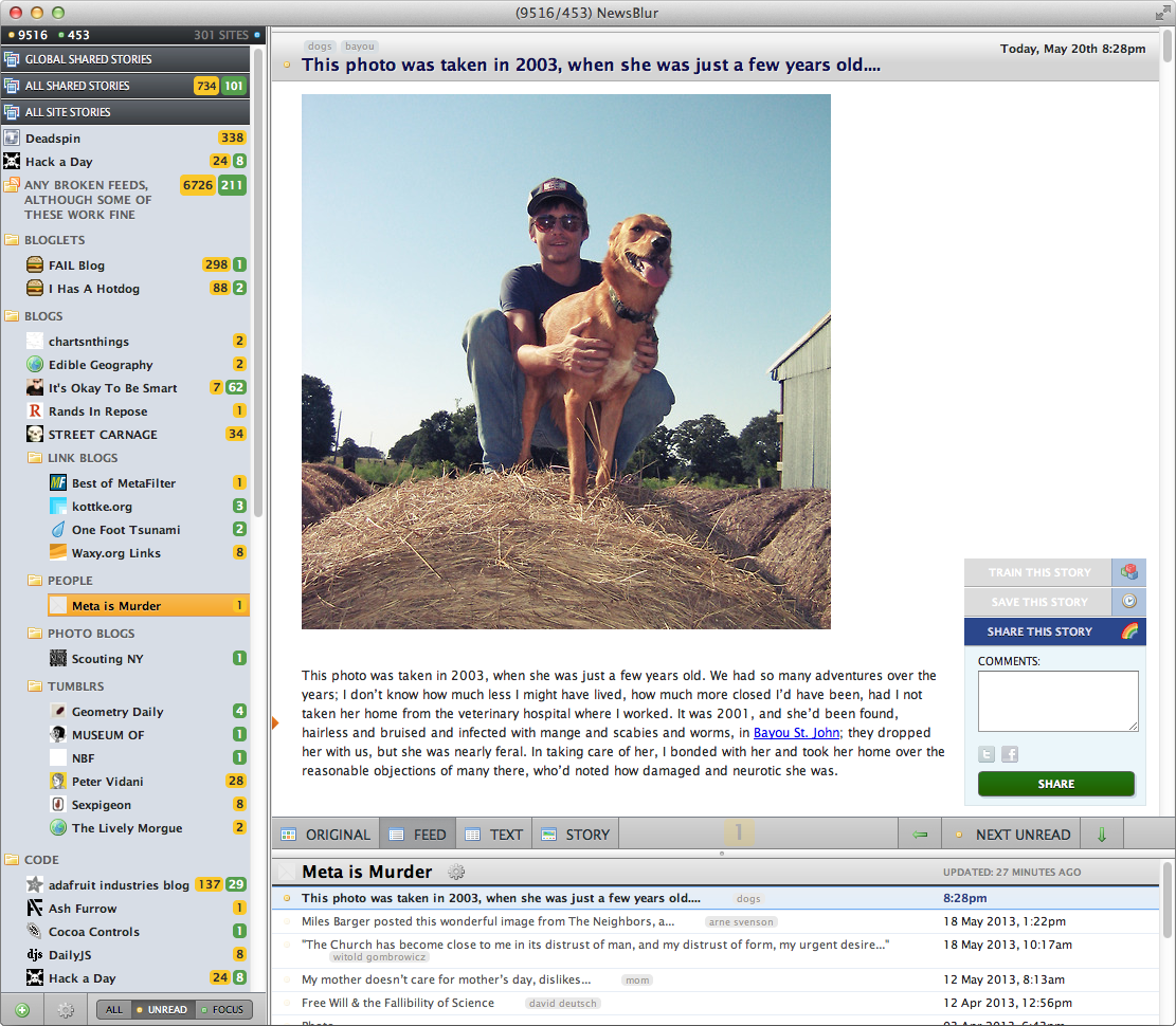
Reading before & after:
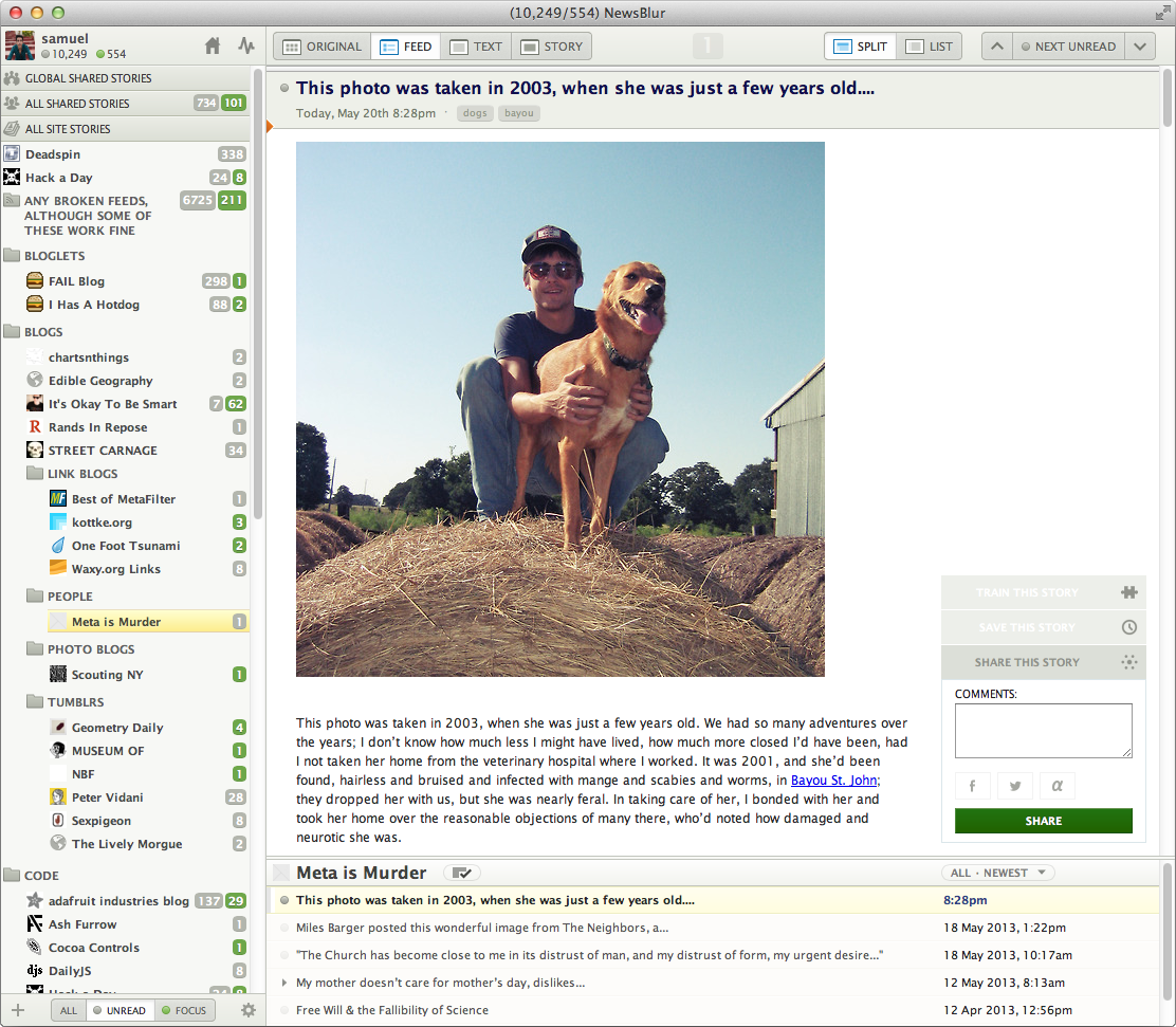
In no particular order, here’s what’s new:
- Unified interactions/activities popover. Gets out of your way and gives the dashboard more room to breath.
- Rewritten feed loader, offering incredible performance, even at the 20x scale of today vs 2 months ago before the Google Reader announcement.
- Custom vector graphics, retina-fying the entire site.
- Increased transparency of sites by showing more detail in feed fetching/statistics.
- A new List view to complement the Split view for stories.
And that’s just for the website. The iOS app, Android app, and blurblogs all got the update goodness that has graced the web app.

As for what’s happening these days, post-Reader:
- Took some extra time to scale out my backend, now completed.
- Running on 48 servers, serving 20x traffic
- Because I had the foresight to charge users for premium service, I’m now confident that NewsBlur will be standing tall a few years from now.
- Working on the next few big ticket features: saved story search and tagging, batch editing organizer, keyboard shortcut manager, and more.
Biggest unanticipated consequence of the Reader shutdown – I no longer have to wear a jacket in SF because my core temperature has risen.
— Samuel Clay (@samuelclay)
And if you’re new to NewsBlur, here’s the six core benefits to using the one with the Sun:
- Training - hide the stories you don’t like and highlight the stories you do. Make mincemeat out of heavy feeds and make sure to never miss stories from the feeds you love.
- Original site - read a publisher’s stories the way they wanted you to read it - on the original website. NewsBlur embeds the publisher’s site in an iframe, and marks what you read as read as you scroll.
- Text view - conveniently extracts the story text from articles, necessary for reading truncated rss feeds.
- Blurblogs / sharing - a social community where you can share and discuss stories with friends.
- Speed - A dedication to fast load times, graphed on your dashboard.
- Mobile - native, first-class iOS and Android apps, with all of the functionality of the website.
Now that the redesign has launched, I plan to blog about how to best use the intelligence trainer efficiently, all new [future] features, and how I was able to successfully scale out the four databases (count ‘em: postgresql, mongodb, redis, elasticsearch) to handle more than 10,000 users and 4 million site updates a day. It’s no Tumblr, but it’s still way more traffic than you can fit on a single machine.
Thanks for using NewsBlur and turning my passion project (four years running) into a full-time dream.
Took some extra time to scale out my backend, now completed.
Running on 48 servers, serving 20x traffic
Because I had the foresight to charge users for premium service, I’m now confident that NewsBlur will be standing tall a few years from now.
Working on the next few big ticket features: saved story search and tagging, batch editing organizer, keyboard shortcut manager, and more."
